
Brucato Amaro

Valley of the Moon Music Festival

Women’s March

Burning Man
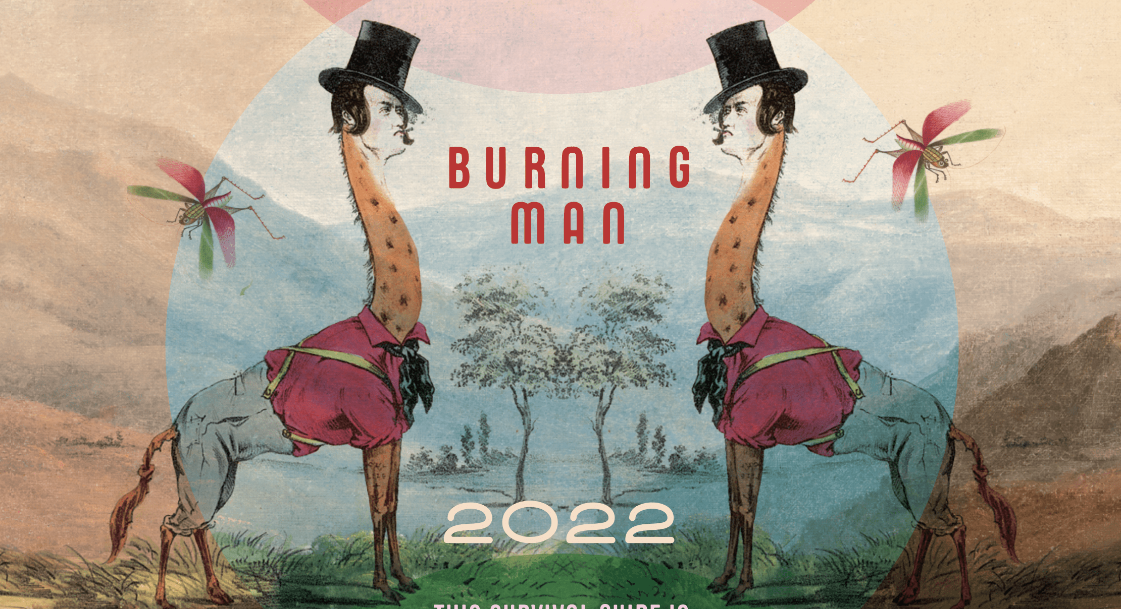
Burning Man Survival Guide 2022

Women's Convention

Let’s Play SF

Haleakala Creamery
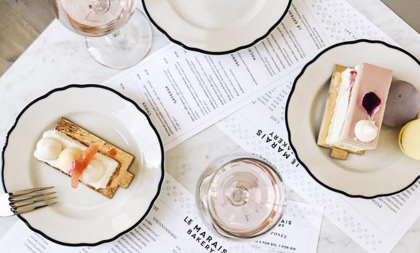
Le Marais Bakery

Bugsy

The Klamath
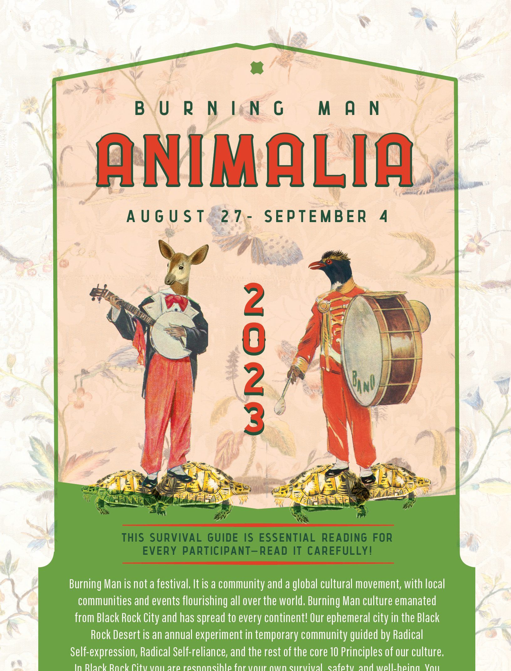
Burning Man 2023

Inka Mama’s
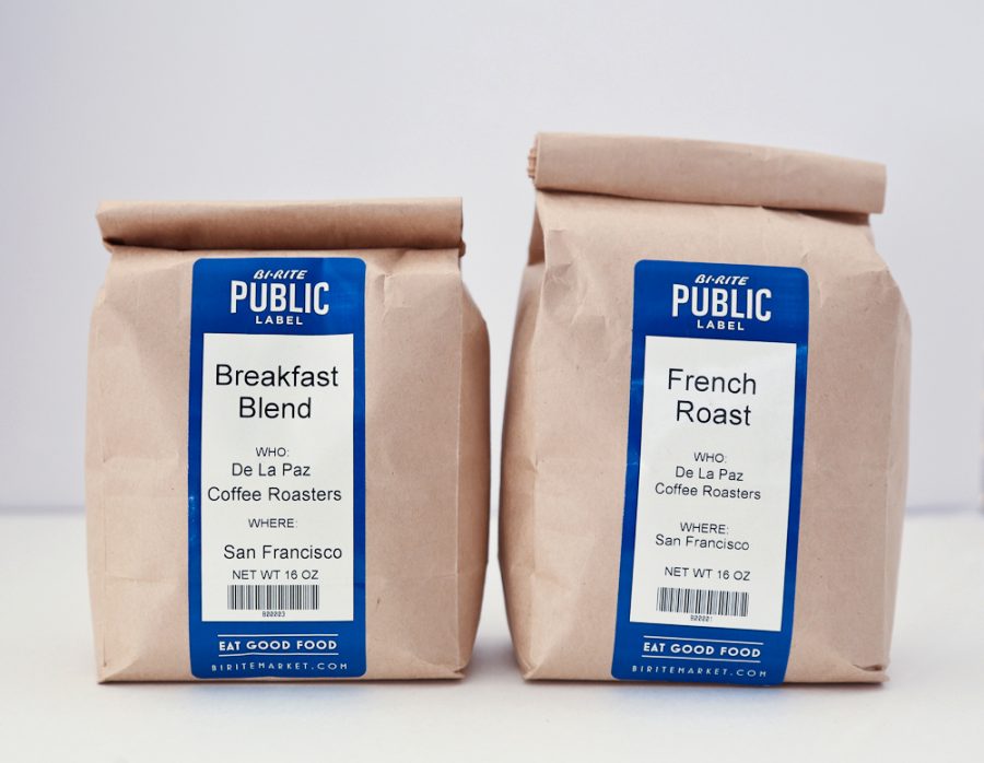
Bi-Rite Market

Plate & Pattern

Getzwell Pediatrics